The Top 16 Sexiest Lit Mag Covers in the Last 6 Years
Karyna McGlynn
Feb 05, 2013
AWP is a few weeks away and, despite my
well-documented anxieties about the whole shebang, I'm particularly looking forward to the book fair this year. When I'm not hunkered down at the
Gulf Coast table hawking
our new "Sexy Lady" issue, I'll be scouring the literary labyrinth for ideas to steal. Since taking on the Managing Editor position last year, I've become an absolute dork about journal design: kerning, gatefolds, paper stock, bindings, pull quotes, CMYK, full bleeds, widows & orphans (those bastards)--these are the things that now wake me up at night.
Gulf Coast does subscription swaps with lots of beautifully-designed journals, but the AWP book fair is the only place to experience the true wealth and variety of lit mag design. In case you can't spot me at said book fair, I'll be the person fondling magazines pornographically, going "
Ooooh, did you guys use Soft Touch matte lamination on this? So
sexy."
In that spirit, I present my countdown of the top sixteen sexiest lit mag covers in the last six years. When I say "sexy" I mean, of course, from a design standpoint: covers that are memorable, covers that pop, covers I wish I had designed. Some of the choices were easy, some painful. Many of the journals I selected are so consistently well-designed that picking my favorite cover was the hardest choice of all. And there were, necessarily, exclusions. If I omitted your favorite, I apologize. Feel free to yell at me in Boston: you know where I'll be.
[NB you can click on the covers to view them in a larger size.]
#16
The Kenyon Review 31.2 (Spring 2009)
The "Man-Reading-Kenyon-Review" Issue
Does hot pink on black ever
not work? A well-chosen splash of color on a great black-and-white photo of some guy reading a 1945 issue of the
Kenyon Review (in 1945) is pure class, and yet so
meta. No wonder they've been around so long.
#15
Missouri Review 33.3 (2010)
The Shadows Issue
Missouri Review loooves to feature cover photos of bodies jumping and flipping and contorting, but of all the bodies-in-motion covers, this one is by far my favorite. The slick placement of the text on the hardwood, the way their logo almost fades into the wall, the word "shadows" along the white shin, the blue underwear, the precarious chair, that dirty foot, and "the eerie photographs of Francesca Woodman"?! Yes ma'am.
#14
Salt Hill 21 (2008)
The Hardcover Issue
This one has to be held to be fully appreciated. First off, it's
hardcover--something almost unheard of in lit journal design. I don't know how
Salt Hill paid for this, but the result is gorgeous. It reminds me of a modern dystopian version of Lotte Reiniger's silhouette animation in
The Adventures of Prince Achmed. Those two little splashes of red: one in the barbecue pit, one on the rocket. And did I mention this thing has gold metallic endpapers?
#13
Caketrain 8 (Nov. 2010)
The Géraldine Georges Issue
Caketrain's design is so good they don't even bother putting their name on the cover anymore. They let their artwork do all the work. I respect that. This one is part Björk video, part blaxploitation, part revenge-of-the-thought-bubble, and
all sexy.
#12
FENCE 20 (Winter 2008-2009)
The "Golden Obama" Issue
Remember the golden, triumphant, champagne-fizzy, HOPE-fueled, liberal homecoming of late 2008? Us to
FENCE: "Hey, can you enshrine this glorious moment on the cover of your experimental literary magazine?"
FENCE to us: "Yes we can!" And they did. With bling.
#11
6x6 18 (2009)
A Barrel of Herrings
It was only a matter of time until letterpress journals showed up on this list. If you don't know Ugly Duckling Presse and you pick up a copy of
6x6 you may not even realize
what exactly you're holding, but you'll open it anyway, because it's like nothing else. The basic design elements of
6x6 are pretty consistent from issue to issue: the square format, the clipped right corner, the rubberband binding, the giant number, the catchy issue name. For those in the know, this is pure UDP. #18 is my favorite: the semi-transparent grape-y font over the intricate pink and green architecture of the background plus the accent of the turquoise rubber band makes me feel like I'm having an affair with an eccentric bookmaker in a Mediterranean villa in 1969.
#10
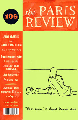
Paris Review 196 (Spring 2011)
The "Poor man, I heard Hanna say" Issue
Starting in 2010, the
Paris Review underwent a relatively minor design change that made a big impact. A circle replaced the bird that had been dominating the upper left-hand corner of the journal for about five years. They got rid of the barcode on the front cover. Color choices became bolder and the whole presentation much, well,
friendlier. I'm a particularly big fan of the big citrus colors, and hand-drawn sketchiness of issue 196. Plus, as a writer I adore visual art that integrates text:
"Poor man," I heard Hanna say. Yes.
#9
Black Warrior Review 38.1 (2011)
The "Wedding Dress & Jellyfish" Issue
BWR's design is always top-notch, but 38.1 is just hauntingly gorgeous. I don't know whether the issue has an actual name but I always
think of it as "the wedding dress & jellyfish" issue. In 2009,
BWR redesigned their logo as an unobtrusive spine wrap-around, brilliantly allowing maximum space to devote to cover art without sacrificing branding. The other great thing about this issue is the cover stock. It feels like velvet, or PVC, or
skin. Seriously, go touch it at the book fair.
#8
Sycamore Review 24.1 (2012)
The Kathleen Lolley Wildflowers & Stardust Issue
Okay,
Sycamore Review just keeps getting sexier and sexier. I couldn't believe how hard it was to choose a
single cover from their catalog, but this one made a big impact on me when it came into the office. The effect of this rich, darkly whimsical art (like something out of a book I would have loved as a child) against the milk-white square of their cover is dramatic, and goes so well with their font. The flipside of the journal provides further delights and simply sucks you down the rabbit hole of reading.
#7
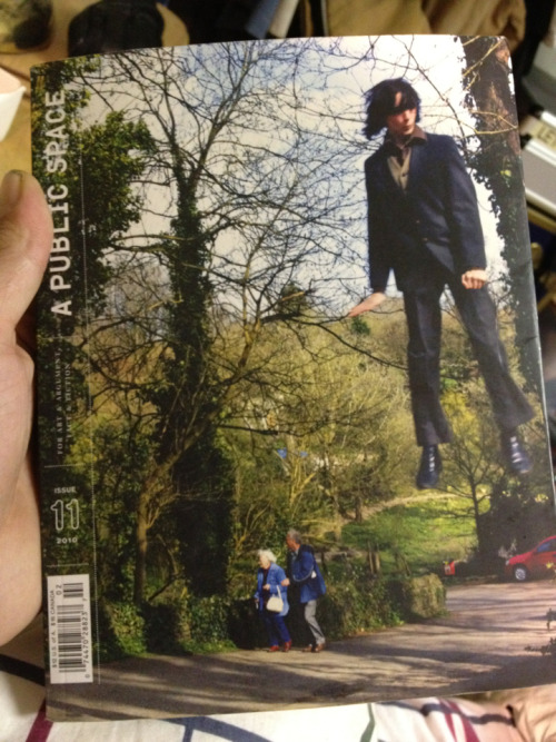
A Public Space 11 (2010)
The "Well-Dressed Jumper" Issue
Every single issue of
A Public Space is a wonder to behold, and, like
Black Warrior Review and
Caketrain, devotes cover space to its always-surprising artwork (like this one: a slightly out-of-focus mod guy levitating high among trees as an elderly couple passes, seemingly unaware). Their sexiest feature, however, is something you can't see in the photo: French flaps--designed with a minimalist aesthetic and set off by colored endpapers. Color me
jealous.
#6
Virginia Quarterly Review 84.1 (Winter 2008)
The Chris Ware Issue
VQR got real super-hero and graphic-novel-y for a few issues back in 2008, and it was hands-down the best look they ever rocked. We always knew they were good, but this Chris Ware cover made them
cool.
#5
Tin House 8.3 (2006)
The "Come in from the Cold" Issue
Not only does everyone seems to remember this issue, they all seem to remember where they were the first time they saw it. (I was at Shaman Drum bookstore in Ann Arbor, where I had, indeed, just "come in from the cold.") What
is it about this girl? Is she crying? Is she embarrassed? Is she playing hide-and-seek? And how
old is she? And how is her stance simultaneously defiant and vulnerable? And how does Tin House get away with putting their name over her face and selling this issue like it's a peppermint mocha from Starbucks? I still don't know, but it works.
#4
Forklift, Ohio 25 (Summer 2012)
The Chalkboard Issue
O,
Forklift, Ohio! You darling of the Table X area and bane of every person who wants to list you in their bio but can't figure out whether to use semicolons for clarity. The only question is
which of your brave, memorable, startling, whimsical covers to choose. The one that looks like a pack of matches? The one made of something sort-of-like-but-cooler-than bubble-wrap? The one made of plastic office mat? The one that looks like a waffle? Ultimately, I chose the one that looks like a chalkboard because it's your newest issue and I love you and want to support you, but I might as well have just used a dartboard to decide. Wait, don't you guys also have an issue that looks like a dartboard? Support this labor of love and they'll probably send you a big, fat, flat pencil that you'll have to sharpen with a whittling knife.
#3
The Lumberyard Magazine 4 (2009)
The "Disco Cowboy" Issue
Wait, you don't know
Lumberyard? This is another labor of love out of Louisville that takes letterpress design into a whole new orbit. It's not just about the cover with these guys: it's every. single. page. They transform every contributor's piece into a piece of visual art, making it something far more interesting than it was before. Some designers and writers might balk at this idea since the pervading aesthetic in literary publishing favors unobtrusiveness, readability, symmetry, and simplicity.
Lumberyard shows us what the opposite of this aesthetic is, and it's fabulous. Why this particular cover? Please: it's a disco cowboy on roller skates.
#2
Ninth Letter 16 (Fall/Winter 2011-2012)
The "Glittery Gigolo" Issue
Probably one of the most memorable journal covers of all time. Words just can't do it justice. Neither can a picture for that matter. I swear, it looks like the cover stock is
made out of glitter, and the back cover features this same cheeseball blowing a glittery kiss at you. We all know
Ninth Letter is the coolest kid on the block. Hell, they even make the barcode look cool. Working there must be a hipster-designer's wet dream.
#1
Copper Nickel 13 (January 2010)
The "Nina Simone Valentine" Issue
Today (as of this writing) is Valentine's Day, and, on a more somber note, I have reserved the #1 spot in honor of
the late Jake Adam York's tireless work on the big, beautiful
Copper Nickel. I've been thinking about writing this blogpost for quite a while, and I always knew I wanted
Copper Nickel on my list, so when I saw Jake at a reading a few months ago I asked him what his favorite
Copper Nickel cover was. "Oh," he said, "definitely the Nina Simone Valentine one." I remember being a bit surprised that he didn't choose one of the flashier covers, but also pleased. I remember getting that issue in the mail and thinking Krista Franklin's "See Line Woman" was like a melancholy love letter from France. It made me hear "
Do I Move You?" in my head as I read. In the publisher's note, Jake Adam York says, "Thank you for reading this literary journal which we think is unique or, if not entirely unique, a rare specimen." Indeed.


Comments (11)
Karyna McGlynn:
Feb 18, 2013 at 08:28 PM
Last minute runner-up! I didn't see Glass Mountain's new cover (which is _wicked_ sexy) until today, but it's got a vintage French maid on it. w00t!
Karyna McGlynn:
Feb 18, 2013 at 08:30 PM
See the pic and go to their launch party here: http://www.facebook.com/events/341662125940347/?ref=ts&fref=ts
Mike Foldes:
Feb 24, 2013 at 10:33 PM
Obviously you've never looked at Ragazine.CC.... On our front page, we show past issues' covers.... please check them out. Think you'll appreciate: http://ragazine.cc/covers/
patricia bjorklund:
Feb 18, 2013 at 10:48 PM
Missouri Review Peril, 2011 Issue. This one just gets me!
Karyna McGlynn:
Feb 24, 2013 at 12:25 AM
Agreed, Patricia. In the end it was hard for me to choose between MR's Peril and Shadow issues. Both are so wonderful.
Hugh Behm-Steinberg:
Feb 19, 2013 at 10:47 PM
Not to toot our own horn, but our cover for issue 13 (by the excquisite Chitra Ganesh) has you all beat: Here's our front cover: https://www.facebook.com/photo.php?fbid=10151550210532715&set=pb.113470992714.-2207520000.1361313976&type=3&theater And here's our back: http://smallpressdistribution.tumblr.com/post/29987505811/eleveneleven13
Karyna McGlynn:
Feb 24, 2013 at 12:38 AM
Oh, man. That's awesomely disturbing. You know, I might have totally put that on the list if I had seen it! If you're interested in doing a subscription swap with Gulf Coast, hit me up at gulfcoastae@yahoo.com
jana:
Feb 18, 2013 at 10:36 PM
Yes, why are literary mags so woefully visually dull much of the time? You missed VQR's invitation to guest-art direct their Female Conscience issue: http://journal6other.wordpress.com/2012/09/06/sex-literature-and-visual-communication/
Elsie Gray:
Feb 23, 2013 at 11:01 AM
I loved this post - it made me want to go out and gather up an armful of mags to take home and read in the bath. Especial kudos to your own chicken cover last summer, which is gorgeous and mysterious.
Lindsey Woodruff:
Feb 24, 2013 at 08:11 PM
How much fun is this article?! I particularly enjoyed the Ninth Letter with the silly man on the cover. But the cover I find most compelling is the Paris Review. The colors are striking. Number 9, 13, 15 are all tied for second though!
Savanna Tarwater:
Feb 25, 2013 at 02:31 AM
I'm taking a Document Production class right now and these are great examples to look at from a "design" aspect. I really like #15, #9, and #7. They really captured my attention.
Add a Comment